Breaking Down TimeSeries: Unpacking the Basics 🕰️
To be honest, when I first came across TimeSeries analysis – I was a bit intimidated.
The idea of predicting the future seemed like a daunting task, full of complex equations, strange algorithms and endless data points.
So, why not take on a challenge that felt as unpredictable as timeseries itself: forecasting stock prices. If I could analyse something as complex as stock data, it would not only help me conquer my fear of timeseries but will also deepen my understanding.
And so began my journey into the world of timeseries forecasting.
In this blog series, I’ll share my experiences with forecasting stock data, including the various methods and modelling techniques I used, as well as how I evaluated their performance.
Given the unpredictability of stock data, I was not expecting great results. For me, this project was more about expanding and pushing my understanding of timeseries.
Basics of TimeSeries
First, let’s start with a simple example.
Imagine a coffee shop tracks the number of customers visiting each day. Over time, patterns emerge in the data. For example, the shop might notice that the number of customers peaks in the mornings and decreases in the afternoons. Or perhaps weekends are busier than weekdays.
By looking at these patterns, the coffee shop can make data-driven decisions like staffing more employees during busy hours or launching promotions when foot traffic is typically lower.
What exactly is TimeSeries?
A timeseries is a collection of data points recorded at regular intervals over time. It helps reveal patterns and trends in historical data, which can then be used to make predictions about future events. This approach is widely used across many industries to forecast demand, detect anomalies and optimise business decision-making.
Key Concepts of TimeSeries:
1. DateTime Index
The date column must be set as the index of the dataset. This ensures all data is ordered chronologically which is required to analyse trends and patterns over time. The date column must also be in a DateTime format to allow aggregation into different time periods. For example, a DateTime index allows daily data to be aggregated into weekly or monthly data.
2. Complete Date Range
There must be no missing dates in the dataset. Missing dates can lead to errors and skewed results in your analysis, affecting the accuracy of findings.
Data Overview
For this project, I decided to work with Microsoft (MSFT) stock data spanning the past five years. This data was sourced from Yahoo Finance (yfinance) and is recorded at a daily frequency.
Data Dictionary:
| Description | |
|---|---|
| Date | Trading Day Date |
| Open | Open price of Microsoft Stock at start of trading day |
| Close | Close price of Microsoft Stock at end of trading day |
| Adj Close | Close price adjusted for dividends and stock splits |
| High | Highest price reached during the day |
| Low | Lowest price reached during the trading day |
| Volume | Number of shares traded during the day |
Focus of the Project: For this project, my focus is forecasting the Close Price of Microsoft stock for the next 7 days.
Data Preparation
Data Cleaning
On inspecting the data, I found the dates were not continuous. There were missing dates for non-trading days such as weekends and US bank holidays. As mentioned earlier, one key concept of timeseries analysis is having a complete and continuous date range.
To address this issue, I re-indexed my dataset to cover the full range of dates, ensuring that every single day within the selected period was included - even if no trading occurred on that day.
By re-indexing, I introduced null values into my dataset for these added dates since the stock market doesn’t trade on weekends and holidays, the data for these days didn’t exist. To correct this, I applied linear interpolation which estimates the missing values by assuming a linear relationship between the stock prices before and after the missing dates.
Other methods to populate missing values could have been used, but for stock data linear interpolation seemed the most appropriate. It preserves the trend seen in the data and avoids introducing any sudden jumps or drops.
Seasonal Trend Decomposition
With a clean dataset, the next step was to perform Seasonal Trend Decomposition. This process is key in understanding timeseries data, it breaks data down into three components:
Trend: Shows the long-term direction of the data, showing whether it is generally increasing, decreasing or remaining stable over time.
Seasonality: Shows repeating short-term patterns that occur at regular intervals like daily, weekly or monthly cycles.
Residuals: Represents random noise that cannot be explained by the trend or seasonality, often referred to as ‘white noise’.
Breaking the data down into these components allows for greater understanding of the data and gives insight into how best to forecast data.
How do we do this?
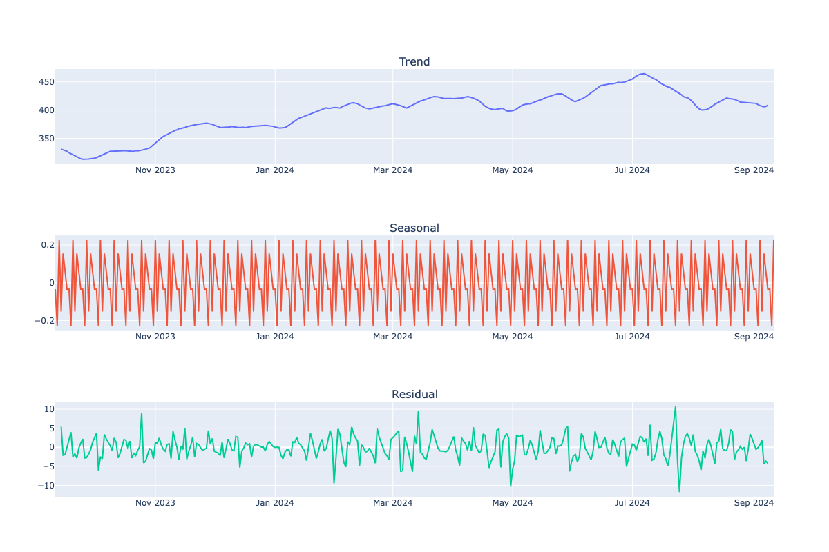
Simply apply the seasonal_decompose function from the statsmodels package to the data. This function breaks the timeseries into three components: trend, seasonal and residual, which can then be examined individually.
Results:
Since the dataset spans over 5 years, assessing seasonality and recent trends visually was challenging. To address this, I reduced the date range to the past year. This made it easier to identify and analyse seasonal patterns and trend.

Trend Plot Throughout the year, there is a clear upward trend in stock prices for Microsoft suggesting solid company growth.
Seasonal Plot Now able to see the seasanlity of data, data seems to follow a weekly cycle. Data appears to peak every Wednesday and dip each Tuesday.
Residual Plot The residual plot should show randomness with no obvious patterns. This indicates that the seasonality and trend components have effectively captured patterns in the data, leaving the residuals as random noise. In this example, the variance in the residuals is not constant and shows some fluctuations, there are no clear patterns. This suggests that the model has performed reasonably well but may still be missing some patterns in the data.
Stationary Data
For accurate forecasting, timeseries models require stationary data. Stationary data means that the data’s mean and variance remain constant over time. This is important because many forecasting models, like machine learning models, assume that all data follows the same distribution.
How to make data stationary
Variance
To make the variance constant, you can either take the log transformation or apply box-cox transform.
-
Log Transformation: Used when data is multiplicative meaning the variance increases as the trend increases. Log transformations squeeze the data to a logarithmic scale stabilising the variance.
-
Box-Cox Transformation: Can normalise both mean and variance of data. It can be applied using the boxcox function from scipy.stats.
Mean
To make the mean constant, you can apply differencing to the data. Differencing involves subtracting the previous value from the current value and helps to remove both trend and seasonality from the data. There are two types of differencing you can apply:
1.First-Order: Subtracting previous value from the current value, this removes the trend in the data.
2.Seasonal: Subtracts value from the same season in a previous cycle, this removes seasonal patterns in the data. For instance, for this project we know the seasonality is 7 days (as seen from seasonal trend decomposition), you would subtract the close price from the same day of the previous week.
Testing for Stationarity
To check if data is stationary, you can use the following methods:
1. Augmented Dickey-Fuller (ADF) Test:
Statistical test to determine if timeseries data is stationary where the null hypothesis of ADF test is that the data is non-stationary.
You can use the adf function from the statsmodels package in Python to perform this test.
The output includes the p-value, if this value is less than 0.05 (adjustable threshold) then the null hypothesis can be rejected and the data is likely to be stationary. If the p-value is greater, we fail to reject the null hypothesis and the data is likely to be non-stationary.
2. Visualisation
Plotting the timeseries data and inspecting it for signs of non-stationarity. Key indicators include trends, seasonality and changing variance.
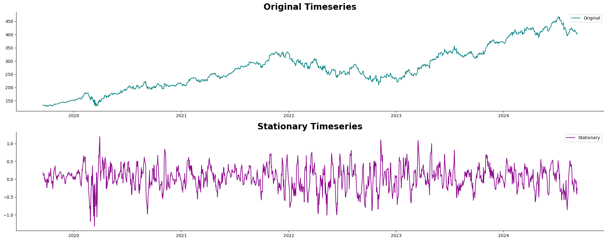
Below is a plot comparing the original timeseries with the timeseries after applying boxcox transformation and seasonal differencing (with a seasonal period of 7).

This plot compares the original timeseries with the stationary timeseries. The original timeseries shows trends and seasonality in the data. In contrast, the stationary timeseries has been transformed to remove these trends and seasonality, resulting in a more stable mean and variance. By comparing the two, it is clear how the transformation done above has standardised the data, making it more suitable for forecasting.
I find it best to use both methods to ensure the data is stationary before moving to forecasting.
Summary
In this first part of the series, I have covered the fundamentals of timeseries analysis, including data preparation, cleaning and ensuring the data is stationary.
In Part 2, I will explore various forecasting techniques including baseline methods, exponential smoothing and ARIMA. I’ll also evaluate their performance and see how they compare in forecasting close prices.