Breaking Down TimeSeries: Forecasting 📈
In Part 1, I discussed the fundamentals of timeseries analysis, including data preparation, data cleaning and ensuring data stationarity — all of which are required to prepare the data for forecasting.
In this post, I will begin by exploring baseline forecasting methods, followed by exponential smoothing techniques and advanced forecasting models such as ARIMA. I’ll discuss the performance of each approach and carry out a comparison between the models.
Train/Test Split in TimeSeries Data
In traditional machine learning, the data is often split into two sets: a training dataset and a test dataset. The training dataset is used to build the model, while the test dataset evaluates the model’s performance. This approach helps to ensure that the model learns from majority of the data and is tested on the remaining unseen data. However, this method can lead to data leakage if the model unintentionally ‘sees’ the test data, resulting in inaccurate high performance and poor performance in the real world. One way to prevent data leakage is to use cross-validation.
What is Cross-Validation?
Cross-Validation is another method to split the input data. The idea is to randomly split the data into multiple subsets (called folds). The model is trained on some folds and tested on others, this is repeated multiple times. This technique provides a more reliable estimate of the model’s performance.
Cross-Validation for TimeSeries Data
In part 1, we already discussed the importance of chronological data in timeseries. Traditional cross validation methods randomly split the data, this will not work with timeseries as we need to preserve the chronological order.
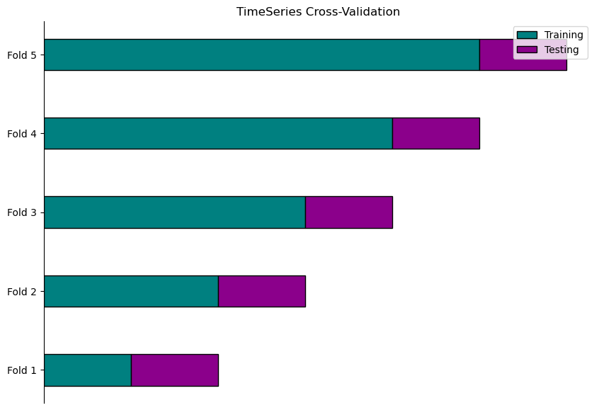
To address this, we can use the TimeSeriesSplit function from scikit learn’s model_selection library. It splits the data into folds while preserving the chronological order of the data.
How TimeSeriesSplit Works
Initialisation: Pass number of splits as a parameter. For example, if you set n_splits=5, TimeSeriesSplit creates 5 different training and test sets.

Splitting Process:
-
First Split: Train on the initial segment of the data and test on the subsequent segment.
-
Subsequent Splits: Expands the training set to include more historical data and adjusts the test set accordingly. Each split moves the training and test sets forward in time.
Below is a graphical representation of the splitting for each fold:
Forecasting Evaluation Metrics
Before I dive into the specifics of the forecasting methods used, below is a brief explanation of each metric I used to assess the models:
Mean Squared Error (MSE)
MSE measures the average of the squared differences between predicted and actual values. By squaring the errors, this metric gives more weight to larger errors and outliers.
Mean Absolute Error (MAE)
MAE calculates the average magnitude of errors in predictions without considering their direction (i.e. whether predictions are over or under the actual values). It provides a straightforward measure of how far predictions are from actual values on average.
Root Mean Squared Error (RMSE)
RMSE is the square root of the MSE, it measures the average magnitude of the errors in the same units as the original data.
Mean Absolute Percentage Error (MAPE)
MAPE measures the average percentage error between predicted and actual values. It helps in understanding how large the errors are relative to the size of the actual values.
Baseline Forecasting
There are four main baseline forecasting methods: Mean, Naive, Seasonal Naive and Drift. These methods are simple approaches we can use to start forecasting future values based on historical data.
Even though these methods are basic, they serve as a benchmark. By comparing the performance of more advanced models like ARIMA against these simpler methods, we can assess whether such methods offer improvements in accuracy or if they perform just as well as the simplest methods, despite their added complexity.
Let’s look at each method in detail:
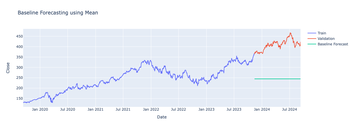
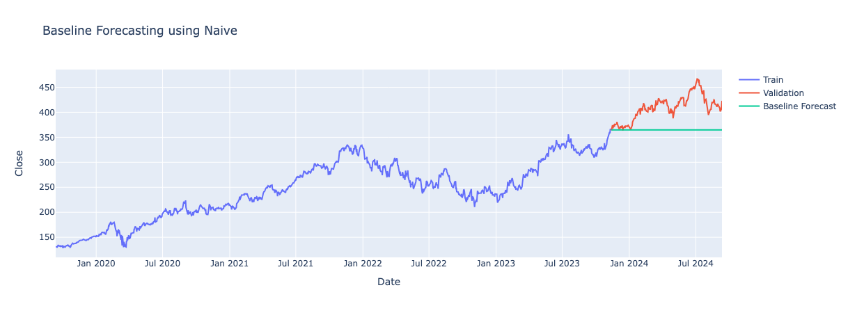
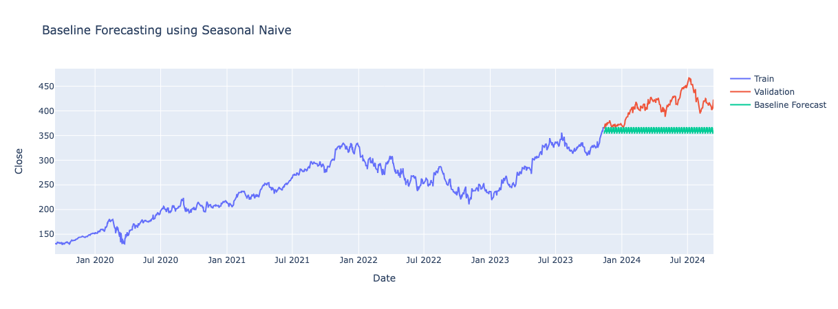
Note: Each graph displays the training, test and forecasted values from a specific fold —the one that performed the best among all folds during cross-validation.
Mean Method
Predicts future values by calculating the mean of all past observed values. This a straightforward method and easy to implement but is limited as it fails to capture the trend and seasonality in the data.
Naive Method
Assumes the last observed value is the next future value. Again, this method is easy to implement and does capture part of the trend however fails to capture the direction of the trend and seasonality.
Seasonal Naive Method
Predicts the next value to be the same as the last observed value from the same seasonal period. For example, if the data shows a weekly pattern, it will use the value from the same day last week as the forecast. This method captures seasonal patterns in the data well but fails to incorporate the trend into its predictions.
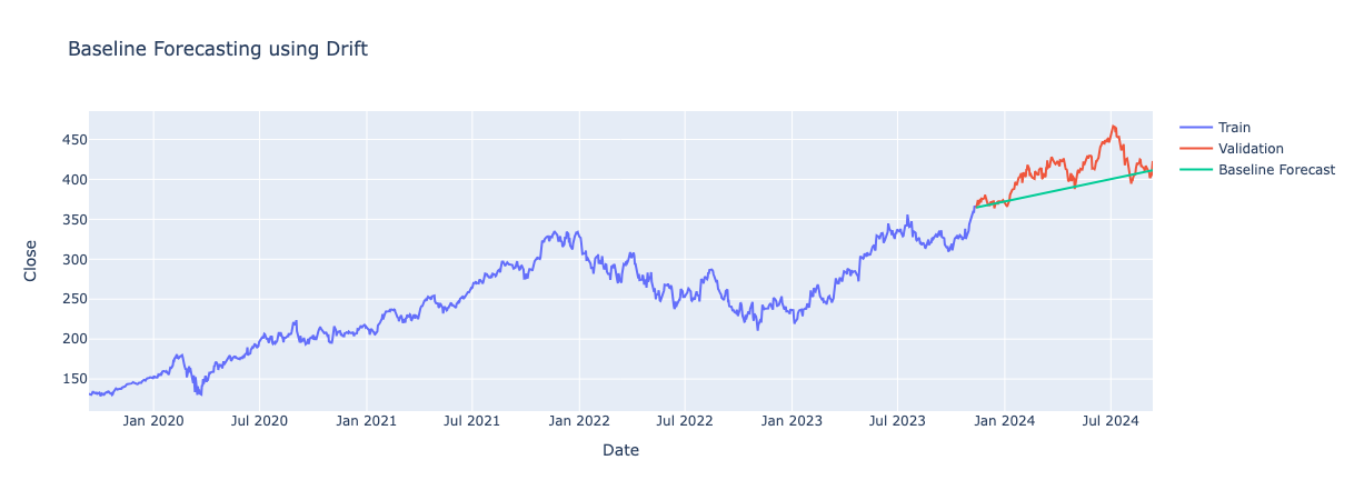
Drift Method
Predicts future values by extending the trend line that is formed between the first and last data points observed in the training data. It assumes the trend in the training data will continue. This method captures the direction of the trend but not the seasonality.
Comparing Baseline Forecasts
By looking at each of the graphs, it appears that the Drift Model produces predictions closest to the actual values. We can also look at the evaluation metrics of each model and do a comparison. Since I performed cross-validation, I took the mean of performance across all folds and compared these results.
| Method | MSE | MAE | RMSE | MAPE |
|---|---|---|---|---|
| Drift | 1716.65943 | 32.93316 | 38.244796 | 11.454145 |
| Naive | 2575.061318 | 40.620242 | 46.571646 | 13.068402 |
| Seasonal Naive | 2972.172213 | 43.653461 | 49.507926 | 14.027392 |
| Mean | 10176.668043 | 86.896259 | 91.006774 | 27.540473 |
The Drift forecasting model demonstrates the best performance among the baseline methods. By extending the trend line from the training data, it provides forecasts that closely align with the underlying trend of the stock prices. This approach results in the lowest error metrics, indicating that the Drift model is more accurate in predicting future values compared to the Mean, Naive and Seasonal Naive methods.
Although the Drift model outperformed all other baseline models, the error metrics are still relatively high. This suggests the model is too simple to deal with the complexities in stock data. Therefore, I explored Exponential Smoothing methods to see if they offered improved results.
Exponential Smoothing Methods
Building on what we’ve learned from baseline forecasting methods, let’s explore Exponential Smoothing. These methods can capture more nuanced patterns in stock data, such as underlying trends and seasonal fluctuations. By giving more weight to recent observations, Exponential Smoothing can better adapt to changes and provide more accurate forecasts.
What is Exponential Smoothing?
Exponential Smoothing is a forecasting method that applies greater weight to more recent observations while exponentially decreasing the weight of older data points. This approach helps in making predictions based on the most current trends in the data.
There are three Exponential Smoothing methods that can be applied to the data, all are available in the holtwinters package in Python:
Simple Exponential Smoothing
This method is used for data with no obvious trend or seasonality. It averages past data by giving greater weight to most recent data and progressively less weight to past data points. This is done using a smoothing parameter which controls the influence recent data has on the forecast.

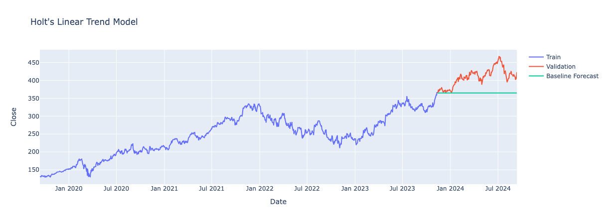
Holt’s Linear Trend Model (Double Exponential Smoothing):
Extends Simple Exponential Smoothing by adding a trend component, so forecasts account for both the level (baseline average) and the direction (trend) of the data.
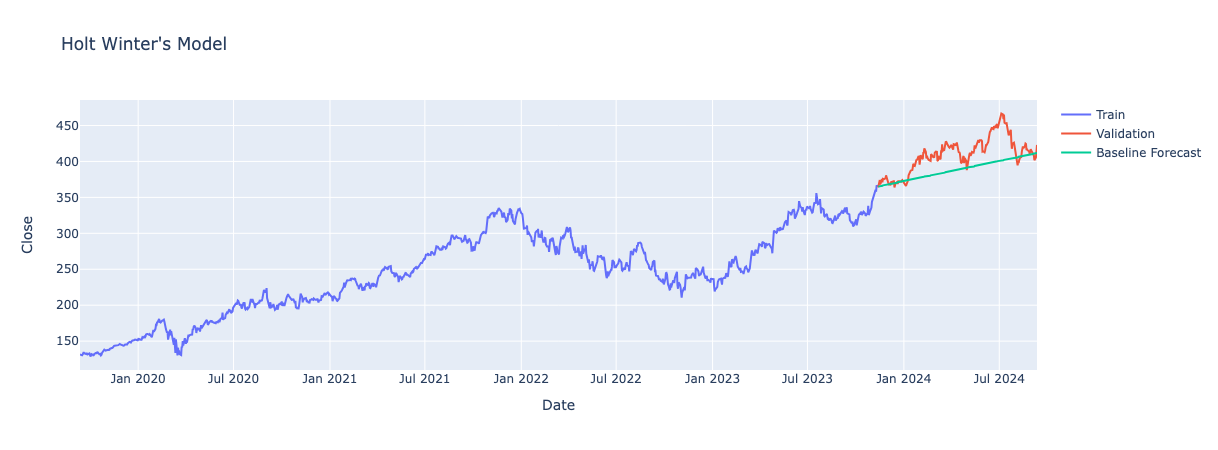
Holt Winter’s Seasonal Model (Triple Exponential Smoothing):
Builds on Holt’s Linear model by adding a seasonal component, allowing forecasts to account for both trends and recurring seasonal patterns.
Comparison of Exponential Smoothing Methods
For my project, I explored all three Exponential Smoothing methods to see how each handles different patterns in the data I found this useful as it gave me a deeper understanding of the strength and nature of trends and seasonality in the data. This helped when it came to applying and interpreting more advanced forecasting models like ARIMA.
Since all three methods have differing parameters, we will examine the result tables for each method separately. Unlike the baseline methods where I calculated the mean across all folds, here I present the individual results for each fold to give a more detailed look at the model’s performance.
Simple Exponential Smoothing Results
| Fold | MSE | MAE | RMSE | MAPE | Smoothing Level |
|---|---|---|---|---|---|
| 1 | 531.380455 | 17.384185 | 23.051691 | 7.562191 | 0.745314 |
| 2 | 3182.182868 | 50.371534 | 56.410840 | 16.692884 | 0.848489 |
| 3 | 686.818708 | 22.400404 | 26.207226 | 9.141777 | 0.912850 |
| 4 | 6024.527907 | 69.731175 | 77.617832 | 21.822544 | 0.956605 |
| 5 | 2555.278985 | 44.233540 | 50.549767 | 10.488608 | 0.970648 |
The smoothing_level parameter across all folds is close to 1, ranging from 0.745 to 0.970. This indicates that the model relies heavily on recent data points for forecasting, similar to the naive baseline method.
Overall, Simple Exponential Smoothing did not show significant improvement over the baseline methods. The model tends to handle stable data well, as a high smoothing parameter works best when data is consistent. However, it struggles with highly variable data, as it emphasises recent points too much and fails to capture abrupt changes.
Holt’s Linear Trend Model Results
| Fold | MSE | MAE | RMSE | MAPE | Smoothing Level | Smoothing Trend |
|---|---|---|---|---|---|---|
| 1 | 550.98 | 17.82 | 23.47 | 7.76 | 0.679 | 0.071 |
| 2 | 3186.33 | 50.41 | 56.45 | 16.71 | 0.815 | 0.044 |
| 3 | 674.26 | 22.20 | 25.97 | 9.05 | 0.899 | 0.018 |
| 4 | 6024.53 | 69.73 | 77.62 | 21.82 | 0.957 | 0.000 |
| 5 | 2555.28 | 44.23 | 50.55 | 10.49 | 0.971 | 0.000 |
Parameter values for smoothing_level (which indicates how much emphasis is placed on recent data points) and smoothing_trend (which reflects the model’s ability to capture trend changes) vary across all folds. The smoothing_level ranges from 0.679 to 0.970, but the smoothing_trend values are very low, especially in Folds 4 and 5 where it is 0.0, indicating hardly any emphasis on the trend.
Overall, the model’s forecasts are effectively horizontal lines across the folds, suggesting that Holt’s Linear Trend method is not effectively capturing trends in the data. This is likely due to the low trend component, which implies that the model is not adjusting for trend changes.
Holt Winter’s Model Results
| Fold | MSE | MAE | RMSE | MAPE | Smoothing Level | Smoothing Trend | Smoothing Seasonal |
|---|---|---|---|---|---|---|---|
| 1 | 448.91 | 19.11 | 21.19 | 8.81 | 0.732 | 0.0 | 0.0 |
| 2 | 925.71 | 25.18 | 30.43 | 8.31 | 0.843 | 0.0 | 0.000001 |
| 3 | 2576.50 | 43.32 | 50.76 | 17.83 | 0.912 | 0.000001 | 0.0 |
| 4 | 4011.14 | 56.86 | 63.33 | 17.80 | 0.958 | 0.0 | 0.0 |
| 5 | 728.41 | 21.61 | 26.99 | 5.10 | 0.969 | 0.000005 | 0.0 |
The smoothing_level ranges from 0.731 to 0.969, indicating that the model places a high weight on recent data points. The smoothing_trend values are very low, between 0.0 and 0.000005, suggesting minimal emphasis to trend changes. The smoothing_seasonal parameter is also very low suggesting seasonality in the data is very weak.
Overall, Holt-Winters’ method shows some improvement by capturing trends in forecasts. However, the very low seasonal parameter values suggest that the method may not effectively capture weak seasonality in the data. The model’s focus on recent data, combined with its limited treatment of trends and seasonality limits its effectiveness in handling variability.
Advanced Forecasting Methods
After exploring Exponential Smoothing techniques, I moved to more advanced methods to better forecast and capture patterns in stock data. In this project, I explore the following advanced forecasting methods:
ARIMA (AutoRegressive Integrated Moving Average):
ARIMA is made up of three components:
AR – AutoRegressive
These coefficients determine how past values influence current values. In other words, they indicate how much weight the model should give to previous observations. The model automatically calculates the optimal coefficients to improve forecast accuracy.
I – Differencing
As discussed in part 1, differencing removes the trends in the data making it stationary. ARIMA models require stationary data to make accurate forecasts.
MA – Moving Average
These coefficients correct prediction errors by adjusting the forecast. If the model overestimates future values, the MA coefficients help bring the forecast closer to actual data, minimising the difference between predicted and actual values.
ARIMA can be applied using the statsmodels package in Python, where key parameters include the order for each component. The term order refers to the parameters that define the model’s structure and is specified as (p, d, q), where:
p: The number of lag observations included in the model, representing the autoregressive (AR) part.
d: The number of times the data is differenced to make it stationary, representing the integrated (I) part.
q: The number of lagged forecast errors included in the model, representing the moving average (MA) part.
ARIMA Parameters : Determining the Best Order
You can use autocorrelation and partial autocorrelation plots to help identify the best order for AR (p) and MA (q) components:
-
Autocorrelation shows how a time series correlates with itself at previous time points. For example, in stock data, it reveals whether today’s price is related to yesterday’s or last week’s price.
-
Partial Autocorrelation removes the effect of intermediate values. It helps determine if a specific past price, like the price a week ago, directly affects today’s price without influence from the prices in between.
Plot ACF and PACF graphs using the plot_acf and plot_pacf functions from the statsmodels library. The number of lags outside the shaded significance region guides the selection of AR and MA orders.
For differencing (d), use the Augmented Dickey-Fuller (ADF) test to determine how many times you need to difference the data to make it stationary.
SARIMA (Seasonal AutoRegressive Integrated Moving Average)
SARIMA builds on ARIMA by adding a seasonal component to handle repeating patterns in data. SARIMA includes all the components of ARIMA (AR, I, MA) but adds:
Seasonal AR (P) Similar to the AR component but captures relationships between values that are spaced a season apart.
Seasonal Differencing (D) Removes seasonal trends from the data by seasonal differencing.
Seasonal MA (Q) Similar to the MA component but models the seasonal effects of past forecast errors.
Seasonal Period (S) Specifies the number of periods in each season, for this project it would be 7 days.
SARIMA is useful when the data has regular patterns (like monthly or quarterly sales cycles), in addition to the trends ARIMA handles.
SARIMA Parameters : Determining the Best Order
-
Non-Seasonal Parameters (p, d, q): Use ACF and PACF plots as for ARIMA.
-
Seasonal Parameters (P, D, Q, S): Add seasonal elements to the ACF and PACF plots to assess orders. Define S based on the length of the seasonal cycle observed.
SARIMAX (Seasonal AutoRegressive Integrated Moving Average with eXogenous variables)
SARIMAX extends SARIMA to include exogenous variables, that might influence the timeseries. This model helps when other external factors can affect the forecasted value.
SARIMAX includes:
-
Non-Seasonal and Seasonal Components: Same as SARIMA with parameters (p, d, q) for non-seasonal and (P, D, Q, S) for seasonal components.
-
Exogenous Variables (X): Add additional relevant variables to make forecasts more accurate. For example, for stock data, I added 5-day moving average of Close price, trading volume and interest rates – all of which help the model understand how different factors influence stock prices.
SARIMAX Parameters: Determining the Best Order
-
Non-Seasonal Parameters (p, d, q): Use ACF and PACF plots as for ARIMA.
-
Seasonal Parameters (P, D, Q, S): Add seasonal elements to the ACF and PACF plots to assess orders. Define S based on the length of the seasonal cycle observed.
-
Exogenous Variables (X): Choose relevant external factors that could improve model performance, this requires domain knowledge.
Auto-ARIMA
Typically, you can import ARIMA, SARIMA or SARIMAX from the statsmodel library in python and pass in the required parameters seen above. After instantiating the model, you fit it to your data and then generate forecasts.
In my project, I used Auto-ARIMA to automate the selection of ARIMA model parameters. This was due to the challenges I had when manually identifying the best parameters for forecasting using the ACF and PACF plots. Stock data has complex patterns that are difficult to interpret, making the process of selecting the right order challenging.
Auto-ARIMA automatically selects the optimal model components through a grid-search-like approach. It evaluates different parameter combinations to achieve the most accurate forecasts. It’s worth noting that while Auto-ARIMA automates the order selection, the concepts of ARIMA models remain the same.
ARIMA Results
| Fold | MSE | MAE | RMSE | MAPE |
|---|---|---|---|---|
| 1 | 751.96 | 24.81 | 27.42 | 11.29 |
| 2 | 961.98 | 26.47 | 31.02 | 8.80 |
| 3 | 5933.87 | 68.23 | 77.03 | 28.01 |
| 4 | 5795.96 | 68.25 | 76.13 | 21.35 |
| 5 | 421.41 | 16.67 | 20.53 | 3.95 |
Fold 5 represents the best performance among all folds in terms of evaluation metrics (see above), so only be looking into the graph and model summary for fold 5.

Model Parameters:
-
p (Autoregressive Term): 0, model does not use past values in the series to forecast future values, main focus of model appears to be recent errors.
-
d (Differencing Order): 1, one level of differencing needed to make data stationary.
-
q (Moving Average Term): 1, model uses influence of previous day’s error to adjust forecasted values.
Moving Average L1 Coefficient: -0.0616, indicates a slight overestimate and so the model adjusts predictions downwards slightly to compensate.
SARIMA Results
| Fold | MSE | MAE | RMSE | MAPE |
|---|---|---|---|---|
| 1 | 751.96 | 24.81 | 27.42 | 11.29 |
| 2 | 700.31 | 22.55 | 26.46 | 7.50 |
| 3 | 5933.87 | 68.23 | 77.03 | 28.01 |
| 4 | 5761.69 | 67.97 | 75.91 | 21.25 |
| 5 | 553.84 | 19.11 | 23.53 | 4.53 |
Again, only looking at graph and model summary for fold 5, the best performing fold.
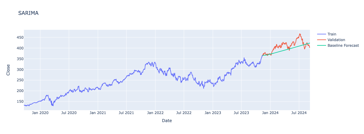
Non-Seasonal Orders:
-
p: 1, model using value of 1 previous day to predict the next value
-
d: 1, one level of differencing to make data stationary
-
q: 0, no influence on models previous error
Seasonal Orders:
-
P: 2, includes 2 previous seasons (a week) to make forecasts.
-
D: 0, no seasonal differencing required, data must already be stationary from non-seasonal differencing.
-
Q: 1, model uses error of previous week prediction to adjusts forecasts.
-
s: 7, seasonality of 7 days patterns repeat each week.
Non-Seasonal Coefficients:
-
AR.L1 (Autoregressive term): -0.0541, suggests an increase/decrease in price seen in previous day leads to decrease/increase of forecasted value.
-
MA.L1 (Moving Average term):None, no moving average terms used for the non-seasonal component as q = 0
Seasonal Coefficients:
-
AR.S.L7: 0.6219, positive coefficient meaning an increase in the price a week a go leads to an increase in forecasted value 7 days later.
-
AR.S.L14: -0.0965, means negative effect from two weeks ago, i.e. increase in price two weeks ago leads to a decreases in forecasted value.
-
MA.S.L7: -0.5649, indicates an overestimate 7 days ago and so the model adjusts predictions downwards to correct.
SARIMAX Results
| Fold | MSE | MAE | RMSE | MAPE |
|---|---|---|---|---|
| 1 | 870.00 | 26.65 | 29.50 | 12.11 |
| 2 | 682.69 | 22.30 | 26.13 | 7.42 |
| 3 | 6055.94 | 68.91 | 77.82 | 28.29 |
| 4 | 5762.29 | 67.97 | 75.91 | 21.25 |
| 5 | 542.69 | 18.93 | 23.30 | 4.49 |
Again, only looking at results for fold 5.

Non-Seasonal Orders:
-
p: 1, no autoregressive terms used in the model.
-
d: 1, one level of differencing to make data stationary.
-
q: 0, model uses influence of previous day’s error to adjust forecasted values.
Seasonal Orders:
-
P: 2, includes 2 previous seasons (a week) to make forecasts.
-
D: 0, no seasonal differencing required, data must already be stationary from non-seasonal differencing.
-
Q: 1, model uses error of previous week prediction to adjusts forecasts.
-
s: 7, seasonality of 7 days patterns repeat each week.
Non-Seasonal Coefficients:
- MA.L1 (Moving Average term): -0.0554, indicates a slight adjustment downward in forecasts due to errors from the previous day.
Seasonal Coefficients:
-
AR.S.L7: 0.6218 – A positive coefficient suggesting that an increase in the price from one week ago leads to a higher forecasted value.
-
AR.S.L14: -0.0961 – A negative coefficient indicating that an increase in price two weeks ago results in a decrease in the forecasted value.
-
MA.S.L7: -0.5653 – A negative coefficient shows that if there was an overestimate 7 days ago, the model adjusts the forecast downward to correct for this.
Exogenous Variables Coefficients:
-
interest rate: -0.1824, showing a strong negative effect on the forecast. Higher interest rates are associated with lower forecasted values, this makes sense since increased interest rates generally slow market activity and potentially lower stock prices.
-
Volume: -1.589e-09, a very small negative effect on the forecast, volume has hardly any effect on the forecasted value. This suggests trading volume does not have a strong impact on the stock price.
-
5 Day Moving Avg: 0.5153, shows a strong positive effect on the forecast. A higher 5 day average tends to lead to a substantial increase in the forecasted value, this makes sense as a higher rolling average over the past five days indicates an upward trend in prices, which would lead to higher forecasted values.
Challenges of this Project
For me, this project has been particularly challenging. While I have developed a solid understanding of timeseries analysis and forecasting, working with a highly volatile dataset was difficult. Stocks are heavily influenced by unpredictable events, which adds a layer of complexity to the forecasting process.
For instance, let’s take a look at the Close price over the last five years for Microsoft.
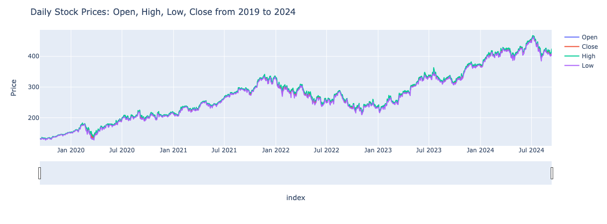
In March 2020, there is a significant drop in stock prices due to the COVID-19 pandemic which led to economic uncertainty and market decline. At the start of 2023, Microsoft’s partnership with OpenAI caused a notable increase in their stock price. Events like this are not predictable. Since timeseries forecasting relies heavily on historical data, accurately predicting such events is very difficult. As a result, despite using advanced forecasting methods, I was still unable to get accurate predictions.
To better improve on the work I have done, here are some potential next steps I could take:
Feature Engineering
I have performed feature engineering to a degree when thinking of some exogenous variables to include for SARIMAX forecasting. To take this further it may be better to predict a feature which is not Close price. For example, predicting whether a stockholder would see a return on their investment could simplify the forecasting process and make it more manageable.
Advanced Models
To explore even more complex methods, such as XGBoost or LSTMs (Long Short-Term Memory networks). While these models may offer improved forecasts, the enhancement might be marginal compared to the increase in model complexity.
Overall, while the current models provide valuable insights, revisiting this project in the future with the above considerations could lead to more accurate results.
Summary
In this post, I’ve explored different forecasting method and evaluated their performance in predicting stock prices. It was quite a journey, with a lot of back and forth as I dug deeper into timeseries and tried to find better approaches.
Despite the challenges, I’m definitely more confident in my skills now. I’m looking forward to diving into another time series project in the future - hopefully with a less volatile dataset!
If you want to see the full project, including detailed insights and code, you can check out the GitHub repository here. Note that since I used Plotly for most graphs, they don’t appear in GitHub since they are interactive. To view them, you’ll need to clone the repository and run the code locally in a Python environment (see requirements.txt). For static images of the plots, please refer to the docs folder in the repository.